 Orvus
OrvusHow to create an optimized landing page? A Guide to Boost Conversions
December 10, 2025
Why a single clear purpose matters
A landing page is a promise. In the world of landing page design, that promise must be simple, measurable and obvious within seconds. If your page tries to do everything-sell, inform, collect emails, and show off the company heritage-it will confuse visitors and kill conversion. The most reliable landing pages do one thing very well: they make a single action obvious and easy.
Start by defining one measurable goal and one precise audience. Is the page for a trial signup, a demo request, or an immediate purchase? Define the success metric in concrete terms: a completed form, a tracked checkout, or a demo scheduled. Then name the audience: small business owners, HR directors, ecommerce store owners with under €1M ARR. This clarity is the foundation of great landing page design.
When you want practical help turning those choices into measurable change, a sensible next step is to get a short diagnostic from experts who work with growth systems every day. For a discreet, tactical consultation that focuses on architecture, measurement and fast wins, check out Orvus growth services-a hands-on partner that aligns technical performance with creative tests.
Match message, offer and experience
Once goal and audience are clear, align headline, offer and user experience to that intent. A visitor coming from a search for “payroll demo” should see a headline that immediately acknowledges that intent. Headlines in effective landing page design are benefit-led, short, and scannable. Follow the headline with a tight hero section: a one-sentence value proposition, a brief subhead that explains the how, and the primary CTA prominently displayed.

Keep choices limited. The primary CTA should be the clearest visual element on the page-use color, shape and whitespace to help it stand out. Repeat the primary CTA where natural, but avoid multiple competing CTAs that ask visitors to decide between mutually exclusive actions.
Where to place social proof and risk reducers
Place a short line of social proof near the top-customer logos, a one-line testimonial with a name and result, or a credible metric that lowers anxiety. Add explicit, simple guarantees or a short return policy if relevant. In intelligent landing page design, social proof is brief, targeted and directly related to the visitor’s intent.
Clarity beats cleverness
People skim. They judge within seconds whether your page answers their question. Make the top of the page answer the visitor’s core question: what do I get, and what do I need to do next? Use simple language, short sentences, and bullets for benefits. White space is not wasted space; it helps users scan and focus on the conversion element.
Sometimes. Minimal designs reduce friction and help high-intent visitors convert faster, but they also remove nuance that can be necessary for complex or high-value purchases. Start with a minimal baseline for the highest-intent traffic, test, and then layer in only those assets that demonstrably improve downstream outcomes.
Technical performance: why speed and stability matter
Technical tuning is no longer optional. Core Web Vitals are measurable signals: Largest Contentful Paint (LCP), Cumulative Layout Shift (CLS) and First Input Delay (FID) or interaction-to-next-paint metrics. Aim for LCP under 2.5 seconds, CLS below 0.1 and interaction latency minimized. These targets are not arbitrary: when pages feel snappy they reduce friction, and reduced friction raises conversion. Performance is a silent conversion lever in every strong landing page design. For recent benchmarks and practical fixes see The Most Important Core Web Vitals Metrics in 2025, Core Web Vitals and Their Impact to Online Business in 2025, and a hands-on guide at How to improve Core Web Vitals.
Use modern image formats like AVIF or WebP, provide responsive srcsets, set explicit width and height attributes, and lazy-load lower-priority images. Serve assets via a CDN and use sensible cache-control headers so returning users get a fast experience.
Mobile-first considerations
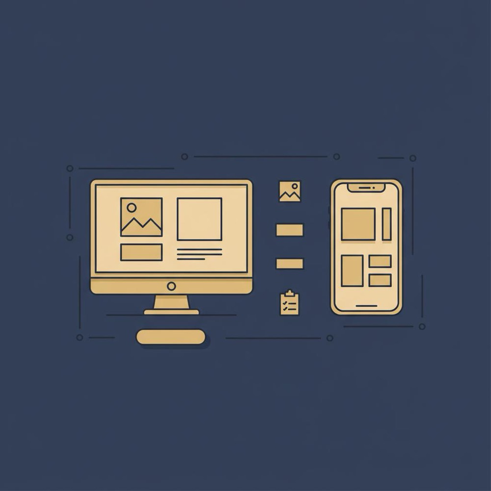
Most landing pages get the majority of traffic from mobile. Prioritize touch targets large enough to tap, legible fonts without pinch-zoom, and single-column layouts that guide the eye down the page. For mobile-focused landing page design, keep forms short and the CTA reachable without excessive scrolling.
UX as structured empathy
User experience is not decoration; it’s empathy shaped into structure. Ask: what question did this visitor ask before clicking your link? Then answer that question in the first 5-10 seconds. Use plain language, a clear visual hierarchy, and place essential details where people naturally look-the top-left and center of the screen on most layouts.
Make scanning easy with short paragraphs, clear subheads, and benefit bullets. Use contrast and whitespace to give breathing room. In practice, excellent landing page design feels like a conversation with one person, not a broad marketing brochure.
Copywriting: promise, proof, and next step
Great copy starts with the visitor’s strongest objection and answers it directly. Headlines should promise a single outcome; subheads can explain the mechanism; the body should deliver proof and remove doubts. Prefer specific outcomes over vague claims: “Reduce onboarding time by 40% in 60 days” beats “Improves onboarding.”
Use active verbs, short sentences, and occasional rhetorical questions to keep the reader engaged. Swap general testimonials for ones with specific outcomes and names where possible. For example, “Reduced onboarding time by 40% for a 450-employee retailer” is more persuasive than “customers love us.” The craft of landing page design is small, careful decisions like this.
Form design that balances volume and quality
Ask only what you need. Each additional field reduces completion rates; however, some fields can increase lead quality. If a phone number is critical for qualification, ask for it; if not, leave it optional or collect it later. Make errors friendly, label optional fields clearly, and for multi-step forms show progress and let users save or continue later when applicable.
SEO for landing pages: intent beats density
SEO for high-performing landing pages is not about stuffing keywords; it’s about matching intent. Choose transactional keywords that reflect the action you want-“book demo [product category]” or “buy [product] online”-rather than broad informational queries. Put the focus keyword naturally into meta title and description, into one heading, and in the opening paragraphs.
Use structured data where it helps: product schema for ecommerce, FAQ schema for common objections, and breadcrumb structured data for clear site structure. Keep content indexable and concise-hide nothing important behind collapsed sections that search engines and users can’t access.
How long should the page be?
The right length depends on intent. Short pages work for high-intent traffic and simple offers. Longer pages help when the product is complex or buyers need more information. A smart approach is to put crucial elements above the fold and provide supporting content below: scannable bullets early, deeper proof and detailed specs further down. This way one page serves both quick deciders and careful researchers within an intentional landing page design framework.
Testing: design experiments to learn business impact
Testing is how you move from opinion to evidence. Run A/B tests with a clear hypothesis, the correct sample size, and a plan to measure novelty effects. A headline change that spikes conversions for two weeks may simply be novelty; validate whether the lift persists across sources and time.
Always tie experiments to business outcomes: track downstream conversions, trial-to-paid rates, and average order value when possible. If you only measure form completions you may optimize for quantity at the cost of quality. Use event-level analytics-server-side measurement or GA4 with server-side tagging-so you can link page experiments to revenue outcomes.
How to design better experiments
Define the hypothesis up front: what do you expect to change and why? Decide the primary metric and the minimum detectable effect you care about. Segment by traffic source where possible, and run tests long enough to smooth out novelty and cyclical effects. If a change impacts a meaningful share of traffic, analyze downstream funnel behavior-did lead quality change? Did AOV shift?
Asset management and performance workflow
Treat images, fonts and scripts as part of the product. Use AVIF/WebP where supported, provide multiple resolutions with srcset, and set explicit width and height attributes to prevent layout shifts. Lazy-load images below the fold and host assets on a CDN. Build asset handling into the design process so performance is not an afterthought in a strong landing page design.
Personalization: start light and measure cost
Personalization can improve relevance, but it costs time, assets and testing overhead. Start with light personalization-change headlines by traffic source, pre-fill form fields, or swap a hero image for traffic coming from a specific campaign. Measure whether the lift justifies the operational complexity. Every personalized version multiplies testing and maintenance in landing page design, so be deliberate.
Trade-offs you’ll face
There are regular trade-offs in landing-page work: more fields increase lead quality but reduce volume; longer pages rank for more keywords but can bury the CTA; personalization increases relevance but multiplies testing costs. Use downstream metrics to guide these decisions: what matters more to your business-lead volume, lead quality, or average order value? Let those priorities govern your experiments and your landing page design choices.
A practical, step-by-step checklist
Use this checklist before launch or as a quick audit:
1) Define one measurable goal and one audience.
2) Match headline, offer and CTA to visitor intent.
3) Put benefit-led headline, short subhead and primary CTA above the fold.
4) Add short social proof near the top.
5) Measure and tune LCP, CLS and interaction delay.
6) Optimize images, use responsive srcsets and a CDN.
7) Keep forms minimal; make optional fields explicit.
8) Run A/B tests with clear hypotheses and measure downstream impact.
9) Use event-level analytics to connect page actions to revenue.
10) Repeat: iterate on the highest-leverage items first.
Real example and what it teaches
One B2B tool had conversion around 3%. The team rewrote the headline to emphasize the outcome visitors cared about, reduced a six-field form to three fields, and swapped heavy hero images for a compressed SVG. LCP improved by about a second and conversion rose to 11% during a focused campaign. The team validated the change by tracking demo-show rates and three-month customer acquisition, and the shorter form increased qualified demos without hurting downstream revenue. This story shows how performance, clarity and fewer fields can compound into measurable business results in effective landing page design.
Common mistakes to avoid
Here are frequent errors teams make:
1) Trying to make the page do everything.
2) Prioritizing fancy visuals over load performance.
3) Measuring only raw form completions and ignoring downstream conversion.
4) Running too many simultaneous tests without managing interactions.
5) Personalizing heavily before validating the base experience.
Measurement and analytics best practices
Track the right events and connect them to revenue. Use a consistent tagging plan and ensure your analytics can stitch journeys across sessions and devices. Prefer server-side event measurement when privacy constraints and ad-click attribution require greater fidelity. When possible, measure trial-to-paid, churn and lifetime value so landing page changes are judged by real business impact, not vanity metrics.
Launch checklist for the first 30 days
After launching a page, follow this cadence:
Day 0-7) Smoke test: links, form submissions, analytics events, and load times.
Day 7-21) Check performance metrics: LCP, CLS and interaction delay. Review user behavior: scroll maps, session replays, and early conversion rates.
Day 21-60) Run a controlled A/B test or iterate on the most obvious friction points. Review downstream metrics after 60 days before a final judgment on long-term change.
Simple templates you can use
Try these quick headline templates for conversion-focused pages:
• "Get a tailored [solution] demo in [timeframe]"
• "Reduce [pain point] by [percent] in [timeframe]"
• "Book a free [service] review - 15 minutes"
Each template is specific, time-bound, and action-oriented-qualities that help your landing page design speak to an intent-driven visitor.
How to prioritize changes when you have limited time
When resources are tight, focus on items that reduce the most friction: headline clarity, primary CTA prominence, form length, and LCP improvements. These four areas are often the fastest path to measurable wins in a typical landing page design audit.
When to involve technical teams
Bring engineers in early for performance work-image delivery, caching and script management are developer tasks. Likewise, measurement and server-side analytics need technical involvement. But keep copy and creative decisions in-house or close to the product owner so messaging stays aligned with the audience and goal. Learn more about the team on the Orvus about page.
Personal note on the craft
Designing landing pages is part craft, part measurement, and part empathy. The best pages feel like one honest conversation with a single visitor. They answer a question, remove doubt, and make the next step obvious. If your work keeps that simple human exchange in mind, your landing page design will have a far greater chance of converting.
Resources and tools to speed the work
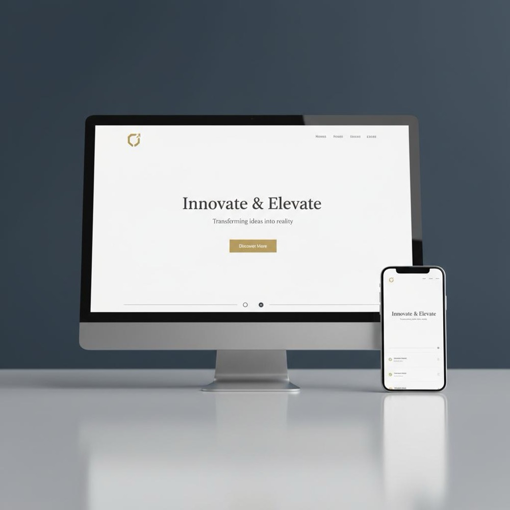
Useful tools include Lighthouse for performance, WebPageTest for deeper timing analysis, and GA4 or other event-level analytics for measurement. For A/B testing, use platforms that integrate with your analytics so you can measure downstream impact. For image workflow, include AVIF/WebP exports and automated resizing in your build pipeline. See more in our useful knowledge posts.
Final reminders before you ship
Confirm three critical things: the headline matches visitor intent, the page loads quickly and feels stable, and the desired action is obvious and easy. Small changes in each area compound. Teams that treat landing page design as a repeatable system-goal, audience, performance, test-find steady, reliable gains over time.
Get a prioritized landing page audit and plan
Ready to move from experiments to steady growth? If you want a short, practical review that ties landing page changes to measurable business outcomes, explore Orvus’ services for a compact diagnostic and prioritized plan: See Orvus services and get started.
Quick FAQ
How long should a landing page be?
There’s no single right length: short pages work for high-intent visitors while longer pages help for complex buys. The practical approach is to keep the CTA visible early, then provide supporting content for those who need more information.
Should I put pricing on the landing page?
If price transparency shortens the sales cycle and reduces wasted leads, include it. If your offers require discovery, focus the page on starting the conversation and being clear about next steps.
How many tests should I run at once?
Run fewer, well-designed tests with clear hypotheses. Overlapping tests without controlling for interaction make results unreliable.
Closing thought
A landing page is a conversation with a single person who arrived with a question. Speak to that question with clarity, speed and respect, and you increase the chance they will answer yours.
There’s no single right length. Short pages work when the visitor is high intent and needs only a small nudge. Longer pages are useful when the product is complex or the buyer needs more trust. A good pattern is to keep the call to action visible early and provide supporting content below the fold for those who want more detail.
Include pricing when transparency helps buyers self-qualify and reduces wasted leads. If price varies or requires discovery, focus on actions that start the sales conversation and explain clearly what happens next. Use testing to see which approach improves downstream qualified leads and revenue.
Measure the metric tied to your single goal (form completions, purchases, or tracked checkouts) and also track downstream outcomes like trial-to-paid conversion, customer acquisition and revenue. Use event-level analytics and server-side tagging where possible so you can connect page interactions to business impact.
References
Want this kind of work done for your business?
We build and run AI-powered marketing and automation. 15 minutes, honest assessment.
Book a call