 Orvus
OrvusWhat is SEO in website design?
December 10, 2025
What SEO in website design really means
SEO in website design is not an add-on or a short checklist you run before launch - it’s a mindset and a set of engineering and content decisions woven into every step of the build. When design, development and content work together from day one, pages are easier for search engines to read and more usable for people. That means quieter launches, less rework and measurable organic gains.
Why design-first SEO matters
Think about a page as a conversation between people and machines. Visual polish matters to people, but machines rely on structure, signals and predictable behavior. The phrase SEO in website design captures the idea that markup, templates, media, navigation and server choices should all be tuned for both audiences. Small things - like semantic headings or a well-named image file - add up. Big things - like template consistency and mobile parity - decide whether a page is found and how it ranks.
If your team needs a friendly, practical partner to help blend design and technical SEO during a redesign, consider learning more about Orvus’s services. They specialize in aligning architecture, measurement and execution so redesigns ship with search in mind, not as an afterthought.
How to read this guide

This piece explains core priorities (mobile-first, Core Web Vitals, structured data), practical tactics you can use in design and development, a launch checklist, measurement strategies, common mistakes and where to start on your next redesign. It’s written for product teams, designers, developers and content authors who want clear, actionable steps - not theory. A simple logo can help with brand recognition.
Keep this guide handy during redesign discussions.
Small design choices-semantic headings, proper image names, responsive images, minimal critical CSS, and template-level schema-reduce friction for crawlers and improve perceived performance. These small, repeatable decisions compound: consistent templates and mobile parity ensure content is indexed correctly and visitors have a faster, more reliable experience, which in turn boosts organic performance.
Core priorities for modern site builds
For 2024-2025 and beyond, three priorities should shape decisions early in the project: mobile-first indexing, Core Web Vitals and structured data. These are not marketing buzzwords; they change how search engines evaluate and index pages (see Google's SEO starter guide).

1. Mobile-first indexing
Google primarily uses the mobile version of a site to index and rank pages. That means the mobile experience must contain the same meaningful content, links and structured data as the desktop site. If you hide important content or structured markup on mobile, the desktop version won’t save you.
2. Core Web Vitals as design constraints
Core Web Vitals - Largest Contentful Paint (LCP), Cumulative Layout Shift (CLS) and Interaction to Next Paint (INP) or similar interaction metrics - measure perceived performance. Treat them as constraints rather than checkboxes. Designers can still be creative; they just need guardrails like performance budgets, critical CSS and lazy-loading strategies to keep the experience snappy. For a concise view of modern SEO best practices, see SEO Best Practices for 2025.
3. Structured data (schema) at template level
Schema.org structured data (usually in JSON-LD) helps search engines understand pages and sometimes display richer results. Template-level schema ensures consistency: a product template can automatically inject Product schema, an event template can expose dates, and a recipe template can mark up ingredients and steps without manual JSON-LD pastes on every page.
Practical tactics designers and developers can use
Below are practical tactics that protect creative intent while improving discoverability and performance. They are intentionally hands-on so teams can adopt them quickly.
Responsive, mobile-first CSS
Start with the smallest viewport and progressively enhance. That approach prevents designers from accidentally stacking large assets and complex layout logic onto small devices. When breakpoints are drawn around the content rather than a mockup, layouts flow naturally and avoid forced reflows. For guidance that connects design and SEO principles, see Web design and SEO key principles.
Modern image strategy
Images are often the largest bytes on a page. Modern formats like WebP and AVIF reduce size without visible quality loss. Pair those formats with responsive delivery (srcset, sizes) so the browser receives an appropriately sized image. Add lazy loading for offscreen media and consider client hints or adaptive serving on the server to further reduce bandwidth.
Fonts, rendering and critical CSS
Custom fonts can block first paint if not handled carefully. Use font-display: swap and preload key fonts for critical UI. Critical CSS (inline styles for the above-the-fold area) lets the browser render meaningful content quickly, while non-critical styles load asynchronously.
Server and transport optimizations
HTTP/2 and HTTP/3 provide multiplexing and lower latency for many small resources. Pair them with a CDN, compression (gzip or brotli), sensible cache-control headers and consistent redirect rules. Small server misconfigurations can negate diligent front-end work, so add server checks to your pre-launch checklist.
Third-party scripts and tag management
Third-party tags can silently inflate JavaScript weight. Use a tag manager that can load non-critical tags after the main interaction or conditionally on user intent. Audit third-party scripts regularly and remove or delay any that don’t contribute clear value.
Templates, schema and content architecture
Templates are not just design shells. They are authoring environments that guide consistent content, metadata and structured data. When templates are mapped to user intent, they surface the right fields for authors and reduce common mistakes.
Keyword-mapped templates
Understand the queries your audience uses and design templates that answer intent. For example: a product template should include fields for benefits, specs, price and availability. A how-to template should include steps, required tools and estimated time. Mapping templates to intent helps authors create pages that satisfy searchers and engines.
Schema baked into templates
Rather than asking editors to paste JSON-LD per page, include template-level schema. A recipe template should produce Recipe schema automatically when the author fills ingredients and steps. This reduces human error and makes structured data coverage predictable.
URL design and canonical strategy
Agree early on URL conventions, pagination handling, parameter rules and the canonical strategy. Predictable, human-readable URLs are easier to crawl and link to. Decide how session IDs, filters and sorting should be expressed and whether they need canonicalization or noindex rules to avoid duplication.
Measurement, testing and the story of impact
How do you prove the value of early architecting? Treat architectural work like any other investment: set hypotheses, measure baseline metrics, implement changes, and compare outcomes. Metrics include Core Web Vitals, page load times, organic traffic to templates and conversion rates.
Synthetic and field tools
Use Lighthouse, WebPageTest and lab tools for repeatable before/after snapshots. Field data - real users’ metrics - is essential because it captures device and network diversity. Combine both: lab for regressions and quick checks, field for true impact.
Search Console and analytics
Link Search Console to analytics and ensure sitemaps, robots.txt and coverage reports are correct. Track impressions, clicks and position at the template level when possible. If you care about engagement, capture micro-events that predict long-term value: add-to-cart, signups, scroll depth or time on content.
Team roles and cross-discipline rituals
SEO in website design works best when responsibilities are distributed. Here are practical role assignments and rituals that keep teams aligned.
Who does what
- Product Manager: owns the checklist and acceptance criteria for launch.
- Designer: defines responsive breakpoints, performance budgets, and critical UI patterns.
- Developer: implements templates, critical CSS, responsive images and server setup.
- Content Author / Editor: fills templates with intent-driven content and metadata.
- QA / Accessibility Specialist: validates ARIA, heading structure and mobile parity.
- SEO Lead (embedded): advises on schema, URLs and measurement - but the work is shared.
Rituals that help
Hold an early alignment workshop where stakeholders map priority pages and agree on mobile parity rules. Add lightweight checks into CI so every PR validates image sizes, critical CSS thresholds or missing schema fields. Celebrate incremental wins in sprint demos to keep momentum.
Pre-launch and launch checklist (practical)
Below is a compact checklist teams can add to a release. It’s intentionally practical and focused on preventing the common surprises that cause post-launch rushes.
Content & templates
- Ensure required template fields are present and validated.
- Check automatic schema output for a sample of pages.
- Verify meta titles and descriptions populate from template fields.
- Confirm heading hierarchy is semantic and consistent.
Performance & rendering
- Run Lighthouse and WebPageTest for representative templates.
- Confirm LCP targets meet your performance budget on mid-tier mobile.
- Verify fonts are preloaded or use font-display: swap.
- Ensure images are served in modern formats and use responsive srcset.
Technical & indexing
- Validate sitemap accuracy and submit to Search Console.
- Check robots.txt for unintended blocking.
- Confirm canonical tags for paginated/filtered views.
- Verify hreflang implementation for international sites.
Server & CDN
- Confirm HTTP/2 or HTTP/3 is enabled where possible.
- Verify compression (brotli/gzip) and correct cache-control headers.
- Ensure redirects are canonical and do not create loops.
- Check CDN configuration and edge caching rules.
Analytics & monitoring
- Link Search Console and analytics accounts.
- Validate key conversion events and micro-engagement tracking.
- Deploy real user monitoring (RUM) and error logging.
- Set up alerts for spikes in 4xx/5xx status codes or dramatic drops in Core Web Vitals.
Common trade-offs and how to decide
Balancing rich interaction with Core Web Vitals requires judgement. Ask: is this interaction part of the critical path? If not, defer or lazy-load it. Profile changes with lab and field tests, and if possible, run A/B tests or phased rollouts to isolate impact.
Example decisions
- A hero animation that delays the LCP might be replaced with a static hero plus a deferred animation for engagement.
- A third-party chat widget can be loaded after the main interaction or triggered by user intent.
- Large data visualizations might be rendered on demand rather than on initial load.
A real-world example: a coordinated redesign
One mid-sized retail team switched to a mobile-first template framework and set a performance budget to cap first meaningful paint at 1.5 seconds on mid-tier mobile. They swapped legacy JPEGs for WebP, used responsive images with srcset, introduced lazy loading and consolidated third-party scripts into a tag manager. The coordinated changes improved LCP, reduced layout shifts and led to a steady rise in organic conversions. The lesson? A set of small, deliberate decisions usually outperforms a single big tweak.
Automation and editorial control
Automation is powerful when it enforces structure without removing editorial quality. Use automation for consistent schema injection, image resizing and basic SEO hygiene, but keep templates flexible so authors can craft compelling copy focused on user intent. Automation should remove mechanical errors - not replace human judgment.
Accessibility and SEO: two sides of the same coin
Accessibility improvements often increase clarity for search engines. Alt text helps screen readers and gives crawlers meaningful context. Correct headings and link text help both people and bots parse content. Making pages resilient to assistive technology and low bandwidth typically improves organic performance.
Measurement: how to show impact
Set a few measurable hypotheses for each architectural change. For example: “Switching product images to WebP and adding responsive srcset will reduce median LCP by 500ms on mid-tier mobile and increase organic conversions from product pages by 8% over three months.” Measure, compare and iterate. Where possible, use A/B tests or gradual rollouts to attribute changes confidently.
Tools and monitoring to make work repeatable
Recommended tools and approaches:
- Lighthouse and WebPageTest for lab audits.
- Real User Monitoring (RUM) for field metrics.
- Search Console for indexing and coverage signals.
- Tag manager for third-party script control.
- CI checks for image sizes, critical CSS thresholds and missing schema fields.
Common mistakes to avoid
- Leaving SEO to one person at the end of the project.
- Assuming desktop content will save you under mobile-first indexing.
- Adding structured data as a last-minute task that requires CMS overhaul.
- Letting third-party scripts accumulate unchecked.
When to bring in outside help
External specialists can be useful when capacity is constrained, when the setup is internationally complex, or when teams need help converting technical work into measurable outcomes. Orvus is one such partner that focuses on blending design and technical SEO during the build process to reduce rework and improve organic outcomes.
Checklist you can copy into your kickoff
- Map top user intents and the templates that must serve them.
- Agree mobile parity rules (content, schema, links).
- Set Core Web Vitals targets and a performance budget.
- Define template-level schema fields.
- Outline URL and canonical rules.
- Configure Search Console and sitemaps.
- Plan server and CDN configuration.
- Add CI checks for images, CSS and missing schema.
- Schedule phased rollout and measurement windows.
How to keep momentum after launch
SEO and performance are not one-time activities. Add lightweight tasks to your backlog: periodic image audits, schema validation checks, performance snapshots and retrospectives on template changes. Celebrate small wins and keep a short list of high-leverage items that compound over time.
Quick reference: practical code pointers
Below are short pointers that developers can use as reminders, not full implementations.
Responsive images: use srcset and sizes to deliver appropriately sized images.
Lazy loading: add loading="lazy" to non-critical images and defer offscreen media.
Preload fonts: use <link rel="preload" as="font" crossorigin> and font-display: swap.
Critical CSS: inline minimal critical styles and defer full stylesheet loading.
JSON-LD schema: include template-level JSON-LD and populate fields from the CMS.
Common FAQs teams ask (short answers)
We cover fuller answers in the FAQ section below, but here are quick responses: yes - merge SEO with design early, measure the impact, prioritize mobile parity and treat Core Web Vitals as design constraints.
Final thoughts
There are no magic pills - only steady craftsmanship. When teams treat SEO in website design as a cross-disciplinary responsibility from kickoff, redesigns are quieter, more effective and more measurable. Start with one template, map the intent it should serve, run it through a checklist and iterate. Small wins compound into a site that delights users and is findable by the people who need it.
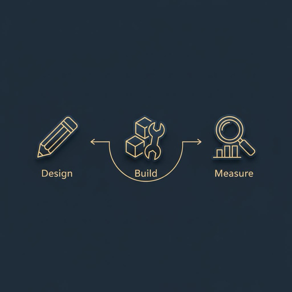
How would you like to get started? Pick a single template, measure baseline metrics, and run a focused improvement sprint. It’s surprising how much progress a short, disciplined effort can produce.
Blend design and SEO for quieter launches
Ready to blend design and technical SEO in your next redesign? Explore practical help and services at Orvus services to get hands-on support that fits your team.
Resources and suggested next steps
- Run Lighthouse and WebPageTest on representative templates.
- Check Search Console coverage and enhancement reports.
- Add RUM to monitor real user Core Web Vitals.
- Create a launch checklist based on the one above and put it in your template repository and on the company blog at Orvus useful knowledge.
As early as project kickoff. SEO should be part of the initial conversations about user intent, templates, performance budgets and server decisions. Integrating SEO at the start reduces late-stage rework and helps align designers, developers and content authors around measurable goals.
Yes. The pragmatic way is to separate critical interactions from decorative ones. Keep the critical path lean and defer non-essential animations or widgets. Profile components' impact on LCP and CLS, use lazy-loading, and consider phased rollouts or A/B tests to measure effects without compromising user experience.
Consider an external partner when internal capacity is limited, when international or complex architecture is involved, or when you need tight alignment between architecture, measurement and execution. Orvus focuses on integrating design and technical SEO during builds, helping teams reduce rework and achieve measurable organic improvement.
References
Want this kind of work done for your business?
We build and run AI-powered marketing and automation. 15 minutes, honest assessment.
Book a call