 Orvus
OrvusCan I do SEO with my phone? Mobile SEO handbook
January 31, 2026
What mobile SEO means in 2026
The central rule for mobile work in 2026 is that the mobile version of a page is the primary version used for indexing and ranking. This mobile-first indexing approach shapes which phone-based edits matter for visibility, so start every quick check with the assumption that mobile-rendered content is the authoritative variant, and confirm parity where it matters Google Search Central on mobile-first indexing.
That means content parity between mobile and desktop matters. If the mobile site shows different text, images, or structured data, those differences will often be the ones search engines evaluate. Use this section to set realistic expectations: some on-phone changes will affect visibility, while deeper infrastructure and rendering problems usually need desktop follow-up.
Run a focused mobile-friendly test before any other quick audit step
Run this first to confirm the mobile view
Mobile-first indexing and why the phone version matters
Mobile-first indexing means the mobile view of a page is the basis for indexing and ranking decisions, so a visible mobile-only change can influence search if it alters what is indexed Google Search Central on mobile-first indexing.
For practical work from a phone, that implies two actions: verify the mobile content you see is what you intend to publish, and capture evidence when it is not. If the mobile page misses key copy or structured markup, flag it for a desktop follow-up and note the discrepancy precisely.
What 'doing SEO on a phone' can and cannot change
On a phone you can change and publish small content edits that affect the mobile-rendered page, such as adjusting titles or short body copy, provided your CMS exposes those fields in its mobile UI web.dev mobile SEO checklist.
However, full-site crawling, extensive template edits, server configuration changes, and deep JavaScript debugging generally require desktop developer tools or remote access to a desktop environment and should be scheduled as a follow-up Screaming Frog guidance on mobile audits.
Quick mobile checks: what you can do immediately on a phone
Start with checks that surface high-value signals quickly: mobile-friendly test, live page inspection, and a URL inspection in Search Console. These steps are lightweight and give immediate yes or no answers you can act on from a phone Google mobile-friendly test.
Use the mobile Search Console UI or app to inspect a URL and read index coverage messages; these interfaces let you check whether a page is indexed or has obvious indexing warnings without a desktop session Google Search Central on mobile-first indexing.
When you run the mobile-friendly test, focus on the rendered view and any explicitly flagged blocked resources. Capture screenshots of the test result and the rendered page so you can attach evidence to a follow-up ticket if something looks off Google mobile-friendly test.
Remember that mobile UIs sometimes hide advanced options. If an interface lacks details you need, mark the issue for a desktop follow-up rather than guessing at a fix on the live site.
A practical mobile SEO workflow: the 7-step checklist
Run these steps when you have a short window and need to make reliable, repeatable checks from a smartphone. Each step ends with a clear decision: fix now, publish small edit, or flag for desktop audit web.dev mobile SEO checklist.
Add the mobile SEO checklist to your workflow
Download or add this checklist to your workflow so checks are consistent across days and operators.
Step 1, mobile-friendly test: paste the URL into the Google mobile-friendly test and confirm the page renders and is not blocked from indexing Google mobile-friendly test.
Step 2, URL inspection: open Search Console URL inspection to confirm index status and recent crawl notes; copy any error text into your evidence notes Google Search Central on mobile-first indexing.
Step 3, on-page content and meta checks: view the visible title, H1, and the first paragraph on the mobile render. If the CMS exposes the title and meta description fields, note whether they match what Search Console and the rendered page show web.dev mobile SEO checklist.
Step 4, basic page speed observation: use an on-device Lighthouse snapshot or the mobile performance tools you have to note obvious render-blocking issues or large images that slow the initial render Search Engine Journal on tools and workflows.
Step 5, capture screenshots and notes: take a screenshot of the rendered page, the mobile-friendly test result, and any Search Console messages. Annotate key areas with short notes to explain the problem and reproduction steps.
Step 6, lightweight CMS edits if safe: if the change is a targeted title tweak, brief copy clarification, or image alt text update and your CMS mobile app supports it, make the edit and publish a small update; always screenshot before and after and add a log entry web.dev mobile SEO checklist.
Step 7, schedule desktop follow-up: for anything that looks systemic, such as missing structured data, canonical anomalies, or crawl coverage warnings, create a ticket with the captured evidence and set the correct priority for a desktop audit Screaming Frog guidance on mobile audits.
Quick on-phone edits you can actually make
Common safe edits from a phone include updating title tags and meta descriptions when your CMS exposes those fields in its mobile admin, fixing a short paragraph typo, or adding alt text to a single image via the media editor web.dev mobile SEO checklist.
Before publishing any live edit, capture a before screenshot and a reproduction note so you can revert or trace the change later. Treat each mobile edit as part of a chain of evidence: what changed, why, who did it, and when Moz guide to mobile SEO.
Avoid bulk edits or template changes on mobile. Tasks like mass content updates, template adjustments, or structured data overhauls are usually impractical and risky without desktop tools and version control support Moz guide to mobile SEO.
If your CMS supports staged publishing or previewing the mobile render in the admin app, use those features before pushing changes live. When in doubt, flag the change for a desktop review and add clear reproduction steps.
When to pause and move to desktop
Escalate to desktop when you discover issues that require developer tools, such as full-site crawling to check global canonical patterns, log-file analysis to diagnose crawl anomalies, or complex JavaScript rendering problems that need debugging in a browser dev console Screaming Frog guidance on mobile audits.

Signs that should trigger escalation include large numbers of indexing errors, inconsistent server responses on different endpoints, or pages that render differently under simulated device conditions than the live mobile render. Add a clear triage label and attach the evidence you captured on your phone.
Use a simple triage rubric on mobile: emergency when live business-critical pages are broken, fix next for clear mobile-rendering errors that affect content parity, monitor for intermittent or minor visual glitches. This helps teams prioritise desktop time efficiently Google Search Central on mobile-first indexing.
Mobile-friendly tools and apps worth installing
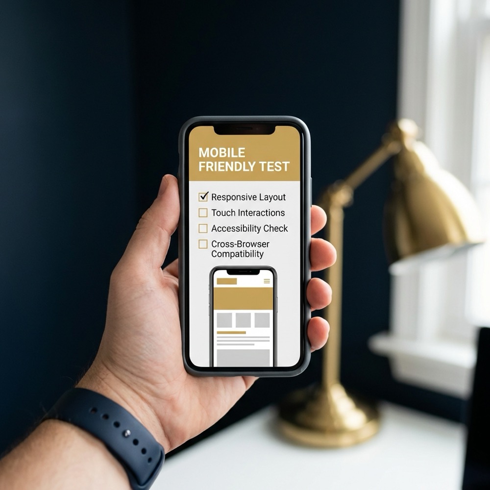
Install the mobile Search Console UI and a trusted analytics app so you can read messages, check index status, and view basic traffic signals on the go; these mobile interfaces are designed for quick triage and message reading Google mobile-friendly test.
Keep a small toolkit of on-device utilities: the mobile-friendly test, a lightweight Lighthouse snapshot tool, a screenshot and annotation app, and a secure CMS mobile app with role controls. Each tool usually exposes a subset of desktop functionality, so use them for rapid checks rather than deep investigations Search Engine Journal on phone tools and workflows.
When setting accounts and permissions, prefer read-only access for most operators and limit publish rights to a small set of trusted users. That reduces the risk of accidental template or bulk changes from mobile interfaces.
How to capture issues on the fly: notes, screenshots, and flags
Capture a minimal evidence set for every finding: the full URL, a screenshot of the mobile render, device and network context (for example mobile and 4G), a timestamp, and concise reproduction steps. This set lets engineers reproduce the issue quickly on desktop web.dev mobile SEO checklist.
You can do many high-value checks and small edits from a phone, but full technical audits and complex debugging require desktop tools; use a structured checklist and clear follow-up tickets to combine both.
A simple priority label helps triage: emergency, fix next, monitor, or desktop audit. Attach the label to your ticket and include one sentence that explains the business impact or the observed symptom.
For ticket templates, use short fields: URL, screenshot(s), observed symptom, reproduction steps, device and network, priority, and proposed next step. Keep each ticket focused on a single issue to avoid mixed priorities and duplicated work web.dev mobile SEO checklist.
Common mistakes and blind spots when doing mobile SEO
A frequent error is assuming content parity without checking the mobile render; if the mobile page omits structured data or important headings, search engines will likely index what they see on mobile, not desktop Google Search Central on mobile-first indexing.
Relying on truncated mobile tool outputs is another blind spot. Mobile versions of tools may hide resource load errors or canonical chains that desktop crawls reveal, so always record issues that seem incomplete and plan a desktop crawl for confirmation Screaming Frog guidance on mobile audits.
Avoid unsafe live edits on templates or bulk content from a phone. Without version control and staging, a mistaken change can propagate widely and be hard to reverse. Use mobile edits for targeted fixes only, and keep a changelog entry for every mobile publish Moz guide to mobile SEO.
Mini scenarios: ecommerce, service sites, and small blogs
Ecommerce: on a product page check that price, availability, and critical buy-flow buttons are visible on the mobile render, and capture a screenshot of the checkout start to confirm functional parity web.dev mobile SEO checklist.
Service sites: test lead forms on mobile by completing a submission flow from a real device and noting any missing form labels or broken redirects; include the form URL and screenshots in your ticket if you find issues Moz guide to mobile SEO.
Small blogs: make safe freshness edits like updating an introductory paragraph, correcting image alt text, or fixing internal links that are visible on mobile. These small changes can keep content accurate and help with short-term indexing verification web.dev mobile SEO checklist.
What a mobile audit flags versus a desktop audit
Mobile checks reliably surface rendering problems, blocked resources, and obvious page speed bottlenecks that affect first contentful paint and the mobile user experience Google mobile-friendly test.
Desktop audits reveal different classes of findings: full crawl coverage anomalies, detailed log analysis, and deep JavaScript execution errors that only show when running a large-site crawl and inspecting logs or the server environment Screaming Frog guidance on mobile audits.
Plan audits as a two-step flow: mobile triage to collect evidence and prioritise, then a desktop audit for root-cause analysis on the highest priority items. This sequence keeps desktop time focused where it matters most.
Measuring impact: linking mobile checks to outcomes
From a phone session, record the change, the timestamp, who made the change, and the hypothesis behind it. Tag mobile-origin changes in your analytics so you can compare short-term indexing signals against longer-term traffic trends Google Search Central on mobile-first indexing.
Short-term validation includes checking index status and immediate coverage messages; long-term measurement uses analytics to see whether traffic and engagement patterns change after a fix. Keep expectations conditional and avoid attributing outcomes to single edits without a proper measurement window.
When multiple operators work from phones, keep a shared changelog or dashboard so mobile-origin edits are visible to the team and to whoever will run the desktop audit and deeper measurement later Google mobile-friendly test.
Integrating phone checks into team workflows and automations
Automate ticket creation from your phone-captured templates so screenshots and reproduction steps attach directly to the ticket. This reduces manual copying and ensures engineers get the evidence they need quickly Search Engine Journal on phone tools and workflows.
Create a lightweight dashboard or shared note that lists recent mobile triage items and their priority. Use role rules: who can publish small edits, who approves larger changes, and who runs desktop escalations. Clear roles reduce duplicated work and improve decision making clarity.

Keep automation simple: a webhook from your ticket form to a kanban board, and an agreed naming convention for mobile-origin tickets so they are easy to filter during desktop audits.
When to hire help and what to ask for
When you need a desktop audit, provide a concise brief with the minimal evidence set: URL, screenshots, device and network context, reproduction steps, and your priority label. That helps external reviewers reproduce and prioritise faster Screaming Frog guidance on mobile audits.
Common priorities to request are a crawl coverage review, log-file analysis for unexplained bot behaviour, structured data validation at scale, or JavaScript rendering debugging for dynamic content. Keep scope tight and use your triage labels to direct effort.
Summary: can you do SEO with your phone?
Yes, you can do meaningful, repeatable SEO work from a smartphone if you focus on the right tasks. Mobile-friendly checks, URL inspection, lightweight content fixes, and triage all fit well into a phone-first workflow when paired with clear evidence capture and escalation rules web.dev mobile SEO checklist.
Reserve desktop time for full-site crawls, server log analysis, CI/CD deployments, and complex JavaScript debugging. Use the 7-step checklist as a minimum repeatable workflow and ensure every mobile session ends with a ticket or a clear follow-up plan for anything that looks systemic Screaming Frog guidance on mobile audits.
For teams that need help turning mobile triage into a durable process, a strategic growth partner can help build search architecture, automation, and measurement that reduces desktop backlogs and improves decision making clarity.
You can address quick, targeted issues like meta tags, small copy fixes, and basic mobile-friendly checks; larger technical problems usually need a desktop audit.
Install the mobile Search Console UI, a screenshot and annotation app, a CMS mobile app with limited publish rights, and a lightweight Lighthouse or page speed snapshot utility.
Always capture before and after screenshots, add a short reproduction note, use a changelog, and restrict publish rights to trusted users when possible.
References
- https://technicalseo.com/tools/mobile-first-index/
- https://developers.google.com/search/docs/crawling-indexing/mobile/mobile-sites-mobile-first-indexing
- https://search.google.com/test/mobile-friendly
- https://rocketclicks.com/client-education/tools-available-to-test-your-sites-mobile-friendliness/
- https://moz.com/learn/seo/mobile
- our services
- our knowledge base
Want this kind of work done for your business?
We build and run AI-powered marketing and automation. 15 minutes, honest assessment.
Book a call